Showrounds: streamlining the path from browse to booking
How post launch recordings turned a feature problem into an awareness problem
Senior Product Designer
Product strategy, UX, Interaction design, A/B test design, Mobile design
I led the design of showround booking on Bridebook, letting couples arrange venue visits without leaving the platform. After launch, session recordings showed the real problem: couples didn’t know the feature existed. So the work moved from feature design to awareness design across the whole discovery journey.
Senior Product Designer, partnering with product, engineering and the Revengers squad, who owned venue scheduling.
I owned:
The interaction model for direct and indirect showround requests
The CTA hierarchy on venue profiles, mobile and desktop
Moderated interviews on intent and commitment barriers
Showround management in favourites
Post launch session analysis that reframed the problem
The awareness push at the top of the funnel
Why this mattered
Showrounds are one of the highest intent actions on Bridebook. Couples who request one reach first contact at 15%, against 9.77% for standard enquiries. Through the direct “Arrange a viewing” button, it rises to 22.21%. Yet almost no one used them. Only 30% of enquiries included a showround, and direct booking made up just 5% of enquiry volume. Couples booked on venue websites, or fell back on brochure requests and days of back and forth. The option existed; it just wasn’t visible, understood or trusted.
What we set out to achieve
Business Goals
Indirect showround requests: UK 30% to 35%, IE 31% to 35%, DE and FR 37% to 41%
Direct bookings via “Arrange a viewing”: 0% to 2% in all markets
Hold or improve first contact quality
Keep couples on platform, not on venue websites
User Needs
Research and session analysis showed couples:
Didn’t know they could request a showround without the enquiry form
Missed “Arrange a viewing” low in the hierarchy
Wanted to shortlist before committing to visits
Found commitment language stressful early in planning
Didn’t know how far ahead to book
Design Hypothesis
Making showrounds more visible, accessible and lower commitment at every touchpoint will lift volume without hurting enquiry quality, and couples who book showrounds will convert far better downstream.
Could we give couples at every intent level, from early explorers to ready to commit, a clear, low anxiety path to booking a visit without leaving Bridebook?
What I learned before designing
Research & Insights
Q3 2024 spike data gave an early signal: venues shared 84 Calendly links, generating 30+ direct bookings. “Arrange a viewing” messages had an 88% read rate and a 50% response rate, yet made up under 5% of enquiries. The feature worked. Reach was the problem.
Interviews and session analysis revealed the tension: couples feared commitment. They weren’t against showrounds; they worried a click would tie them to a venue too soon. Language mattered enormously.
Information Architecture
Profiles pushed instant brochures as the main CTA. These bypassed the inbox and went by email, breaking one of Bridebook’s key retention hooks. We tested a showround CTA above the fold instead, and a sticky mobile CTA bar that kept the viewing option in reach.
What we built, and the limits we built within
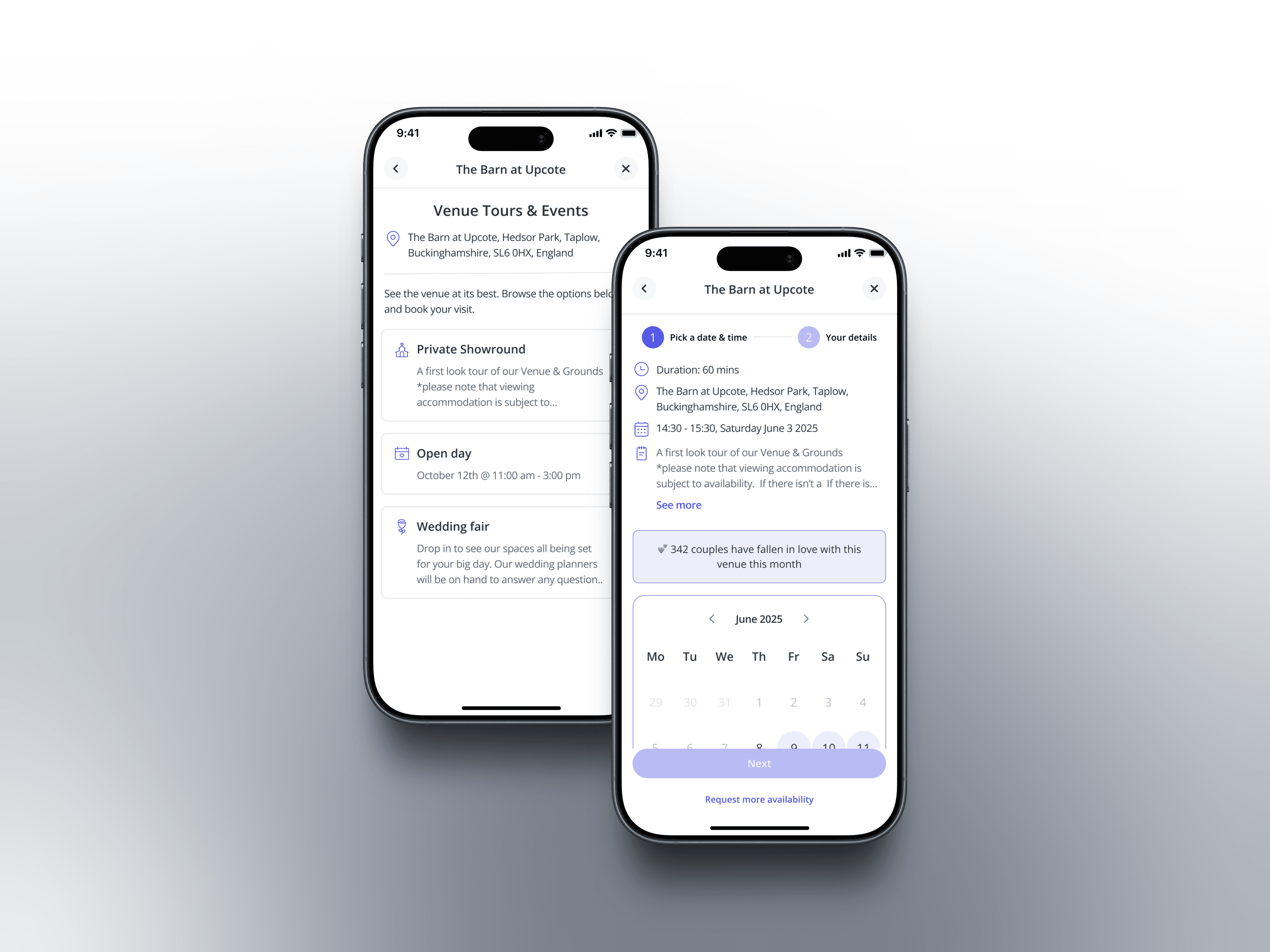
The brief split into two surfaces. Profile CTAs: “Arrange a viewing” sat below the fold as a ghost button. We A/B tested its position, hierarchy and wording, from committal to casual (Book, Arrange, Schedule, Pop in for a look) and the noun (viewing, showround, visit), to find framing that lowered anxiety but still drove action. Favourites: many couples shortlist before they feel ready to enquire, yet favourites had no enquiry buttons. We added showround requests to favourites cards and the expanded view, meeting couples right when they’d signalled intent.
Direct booking depended on the Revengers squad’s scheduling build, so we shipped the indirect CTA first while designing in parallel
“Arrange a viewing” had underperformed in DE and FR, so copy and CTA strategy had to be market specific
Only 17% of venues offered online booking, capping the direct route
How it works for the people using it
Profile CTAs. “Arrange a viewing” moved to primary or co primary, depending on the variant. A softer entry point, “See if it feels right”, led into the full request.
Favourites cards. A request button on cards and the expanded view, plus status labels so couples could track which venues they’d asked to visit.
Smart nudges. After three profile visits without an enquiry, a modal framed around value, not urgency: “You’ve looked at this venue three times. Want to see it in person?”
Ship, then watch. We shipped the CTA changes and watched closely. That’s where the story turned.
The calls I made, and why
1. Run indirect and direct in parallel. We shipped the indirect CTA on its own, so we could learn without waiting on another squad’s timeline.
2. Non committal language as a lever. “Book a showround” suppressed clicks from low intent couples. Softer framing (“See if it feels right”, “Arrange a quick visit”) did better, with no drop in booking quality.
3. Favourites as the highest intent surface. Saving a venue signals interest, so that’s the moment to ask.
4. Reframe after launch rather than defend the hypothesis. Watching recordings, admitting the problem sat upstream and redirecting the work was the project’s most important call. Senior design is as much about how you respond to launch data as what you ship.
How we proved it
After launch, I watched couples in FullStory session recordings. The CTA was more prominent, but showround requests weren’t moving as expected.
The recordings showed an awareness problem, not a conversion one. Couples reached profiles without showrounds in their mental model. By the time they saw the CTA, many had already decided to sort visits out themselves.
So the work moved up the funnel: smart labels on search cards, a showrounds task in the planning checklist (the platform’s most used feature), inline prompts for repeat visitors, and, with marketing, articles and push journeys that introduced showrounds before couples reached a profile.
The principle: showrounds should feel like a normal part of planning, and Bridebook the place to book them, before a couple ever sees a CTA.
Looking back
What worked
A higher CTA lifted visibility immediately: couples who saw it at the right moment clicked
Favourites requests felt logical to couples in testing and matched how they plan
Non committal copy lowered the anxiety barrier
What I’d do differently
Instrument earlier: profile level scroll and dwell data from day one would have separated visibility from conversion faster
Design the awareness work alongside the feature: the signal was in the research, and we underweighted it
Test copy market by market: DE and FR showed UK language doesn’t travel cleanly
Real product work rarely follows the brief. We designed a feature, shipped it and found the constraint wasn’t the feature; it was a context where couples didn’t yet know they needed it.
Reframing around awareness used the same design skills at a different layer of the funnel, and made the work stronger than either phase alone.