loolll
I led the design of a TikTok-style venue discovery experience for wedding couples — a full-screen, image-led browse mode that lets users scroll passively through venue profiles as an alternative to the traditional list view.
I worked as the Senior Product Designer, partnering closely with product and engineering.
I was responsible for:
Defining the interaction model for the gallery view (scroll up/down to switch venues, swipe left/right for more photos)
Designing the mobile-only UI and content card states
Mapping user flows across both home and search entry points
Aligning the design to engagement and retention-focused success metrics
Supporting the A/B test setup across two variants and four markets

Wedding couples browsing venues on mobile had only one mode: a traditional list view. For lower intent couples still in the inspiration and education phase, this felt transactional and effort heavy, it required active effort to compare venues and offered little sense of discovery. We hypothesised that introducing a passive, visually immersive way to browse venues could better match the early stage couple's mindset, increase engagement depth, and create a stronger emotional hook that drives return visits and - ultimately - stronger enquiries.
Business Goals
Increase sign up to non concierge enquiry conversion from 20% to 23%
Increase sign up to favourites conversion from 33% to 37%
Improve scroll depth past the 5th search result from 55% to 65%
Increase Week 1 retention from 19.43% to 20.43%
User Needs Through research and session recordings, we identified that couples:
Want to be inspired, not just informed, during early venue browsing
Are more likely to engage when content feels entertaining and effortless
Respond to visual first formats that mirror familiar social media behaviours
Want to shortlist venues that feel emotionally right, not just logistically suitable
Design Hypothesis Couples who experience the gallery view will engage more deeply with venue discovery because they:
Can browse passively without committing to clicking into full profiles
Build an emotional connection to venues through rich visual content
Have a more engaging reason to keep scrolling and to return
Could a TikTok style, image led browsing experience increase passive venue discovery and drive higher retention and enquiry conversion, without disrupting higher intent user flows?
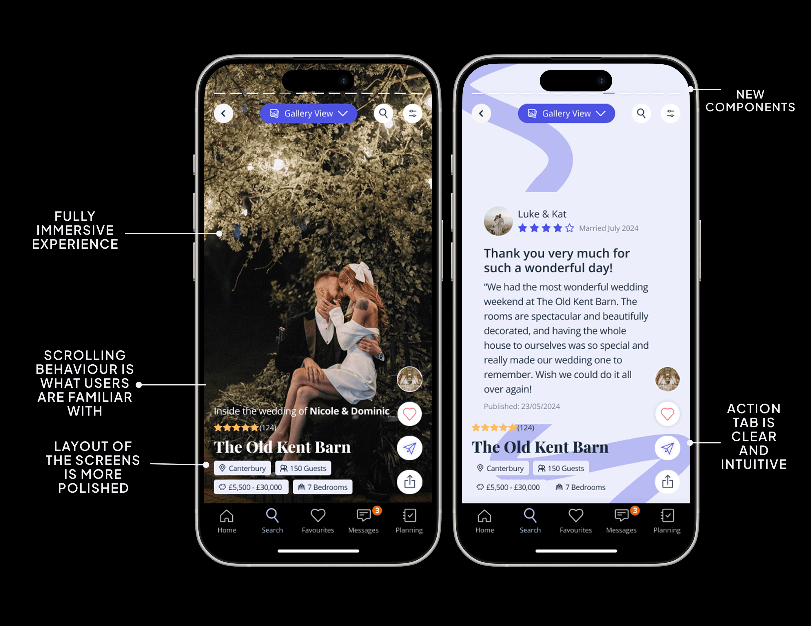
We introduced a third view on search results: the Gallery View. Couples can enter it from both the homepage and the search results page. In the gallery view: Scroll up/down to move between venues Swipe left/right to see more photos, maps, reviews, and videos for that venue Interact via persistent right hand buttons: View Profile, Add to Favourites, Share, Request a Brochure Filter search results as usual
Technical Limitations:
Mobile only implementation (90% of users)
Four markets: UK, IE, DE, FR
Fewer images available in DE and FR (FR median: 9 images; GB median: 14)
Design Constraints:
Had to coexist as a third view option without disrupting existing list and map views
Image quality and quantity constraints in non UK markets required a resilient card design
Interaction data (time on card, scroll depth, discards) had to be captured for downstream ML use

1. Research & Insights
I reviewed TikTok and Instagram Reels research alongside session recordings from FullStory to understand how passive content consumption drives discovery. Key insights:
Short form, scroll driven formats increase the sense of discovery and inspiration
Entertainment value drives continued usage intent more strongly than informativeness alone
Couples browsing in low intent phases respond better to content led formats than query based ones
. Information Architecture
The gallery view was introduced as an opt in third view on search results — accessible via a view toggle — with one variant defaulting to it. This preserved existing high intent flows (list view) while creating a clear alternate path for exploratory users.
3. Interaction Design
Vertical Scroll (Venue Navigation)
Full screen cards designed for thumb driven, one handed use
Scroll direction matches the TikTok/Reels convention: up for next, down for previous
Clear spatial model: each swipe = a new venue
Horizontal Swipe (Content Navigation)
Left/right swipe reveals photos, map, reviews, and video within a single venue card
Horizontal scroll pattern mirrors familiar carousel behaviour
Kept content types visually distinct to reduce cognitive load
Action Buttons
Right hand side persistent buttons for View Profile, Favourite, Share, Brochure
Designed to feel lightweight and secondary — the content is the primary experience
Profile tap loads the full venue profile (not the condensed swiping version)
4. Visual Design
Full bleed imagery to maximise visual impact and emotional resonance
High contrast action buttons for accessibility across varied photo backgrounds
Minimal UI chrome to keep focus on venue content
Cohesive with the existing design system whilst feeling distinctly discovery oriented

A/B Test Structure
Control: Couples see the existing list/map view only — no gallery view option Variant 1: Couples land on list view but have a toggle to switch to gallery view Variant 2: Couples land on gallery view by default
Markets: UK, IE, DE, FR | Platform: Mobile only
Success Criteria:
✅ Test succeeds: Enquiry conversion +3pp, Favourites +4pp, Scroll depth +10pp, Week 1 retention +1pp
❌ Test fails: Meaningful decline in enquiry conversion or retention
Guardrail Metrics:
Enquiry conversion must not decrease
Retention must not drop
Decision 1: Vertical scroll for venue navigation Why: Maps directly to the TikTok/Reels mental model our Gen Z audience already uses. Reduces the learning curve and creates a sense of passive, effortless discovery.
Decision 2: Full venue profile on tap (not condensed) Why: Kept the existing high intent path intact. Couples who want detail can still get it — gallery view is an on ramp, not a replacement.
Decision 3: Interaction data as implicit signal Why: Time on card acts as a weighted shortlist signal, enabling future ML recommendations without requiring explicit user input. The longer a venue holds attention, the more interesting it scores.
Decision 4: Separate test variants for opt in vs. default Why: Crucial for understanding whether the feature works when surfaced proactively versus when actively chosen. Default landing tests the strongest version of the hypothesis.
Sign up to non concierge enquiry conversion → target: 20% → 23%
Sign up to favourites → target: 33% → 37%
Scroll depth past 5th result → target: 55% → 65%
Week 1 retention → target: 19.43% → 20.43%
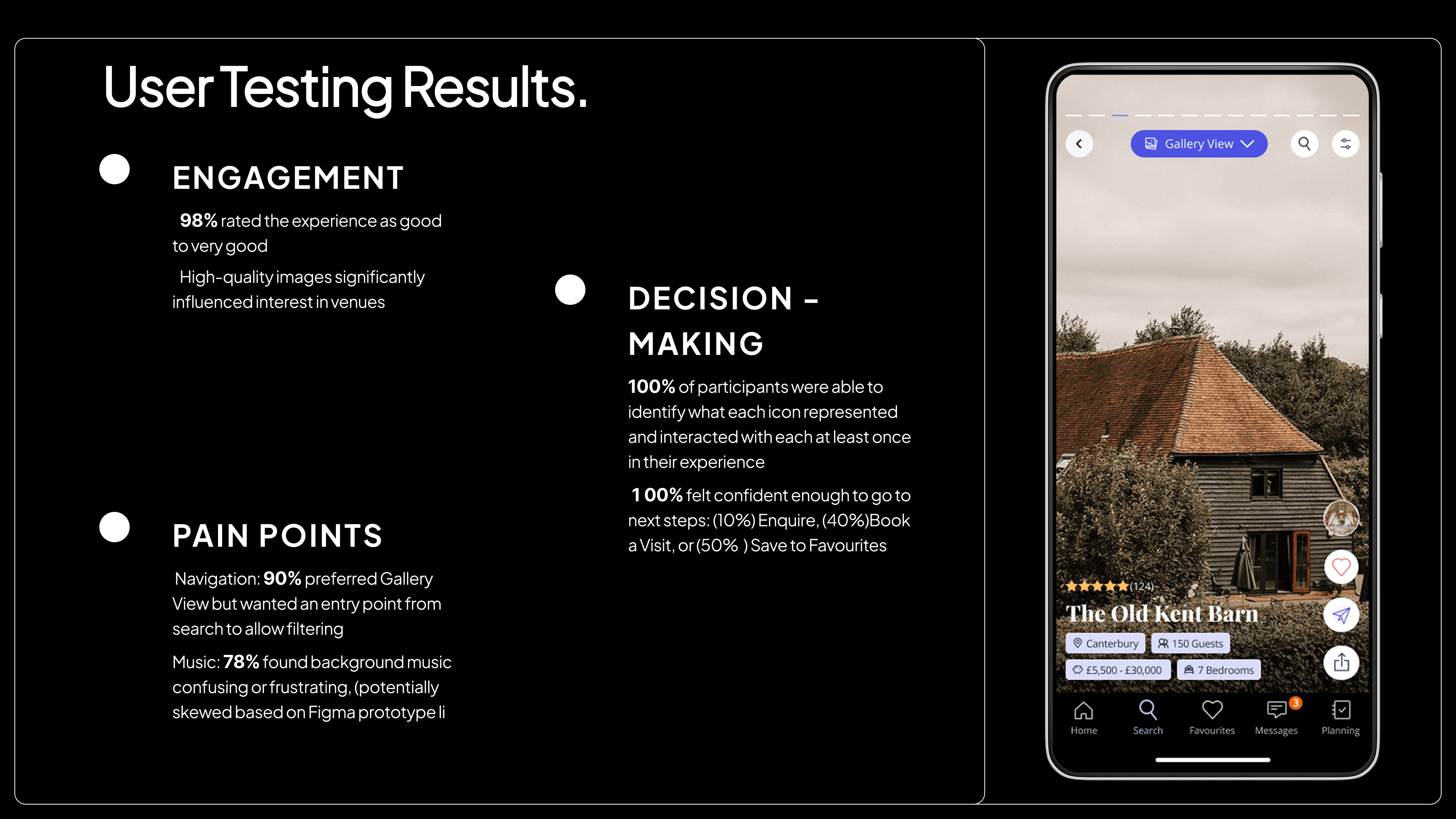
What Worked
The passive consumption model matched real low intent user behaviour — couples did not want to hunt, they wanted to browse
Recording time on card as an implicit interest signal opened up a promising personalisation pathway
The interaction design was simple enough to validate the core hypothesis cleanly
What I'd Iterate On
Build out the "For You" feed concept — bundling ML image search, Gallery Browse, and Venue Stories into a unified discovery surface
Test video content natively within cards, particularly as a differentiator for mature markets
Address the image quantity gap in DE and FR with enhanced content enrichment or graceful fallback states
Gallery Browse explored whether passive, image led venue discovery could shift couples from low intent browsing to genuine engagement — and whether that engagement could compound into higher retention and enquiry conversion.
The project required balancing a strong product vision with real technical constraints: limited image libraries in non UK markets, a mobile only scope, and the need to coexist with existing high performing user flows.
It demonstrated my approach to designing for behaviour change: start with a clear hypothesis, build the simplest testable version, instrument it carefully, and design for what comes next.
