Perfect Match: redesigning how couples discover wedding venues
A swipe based bet on venue discovery, A/B tested against two alternatives
Senior Product Designer
Product strategy, UX, Interaction design, A/B test design, Mobile design
In Q1 2025, Bridebook placed three bets on how couples discover venues. I designed the boldest of them: Venue Swiping, a Tinder style way to shortlist venues one card at a time, powered by recommendations built around each couple’s location, guest count, venue style and deal breakers.
Senior Product Designer on Bridebook’s venue discovery bets, working with product and engineering.
I owned:
The swiping cards and the condensed, image led venue profile
The list variant, with shortlist and discard on each card
Search preferences and the favourites shortlist
Entry points from home and search
The feature metrics, with product: time on card, discard rate and number of plays
[Confirm or edit this list]
Why this mattered
Choosing a venue is one of the biggest decisions a couple makes, yet for low and medium intent couples, Bridebook’s discovery experience asked a lot before it gave anything back: filter, scroll, open profiles and compare, all before they even knew what they liked. Enquiries depend on couples engaging with discovery first, so making that early stage feel lighter mattered. The question wasn’t whether to change discovery. It was which direction to bet on.
What we set out to achieve
Business Goals
Primary: lift conversion from sign up to enquiry
Secondary: lift conversion from sign up to shortlist
Protect: Day 1 and Week 1 retention, profile views and first contact rate (FCR)
User Needs
Low and medium intent couples:
Don’t yet know what they want, but know it when they see it
Find comparing long lists of venues tiring
Want shortlisting to feel quick and enjoyable, not like admin
Need recommendations that respect their non negotiables
Design Hypothesis
A gamified interface like Tinder will lead to more couples engaging with venue discovery and, as a result, sending an enquiry.
Could a playful, swipe based way to shortlist venues get more couples engaging with discovery, and sending enquiries, without costing the venues that pay to be seen?
What I learned before designing
Three bets, one question
Rather than back one idea, we framed venue discovery as three bets, each with the same audience, entry points and primary metric, so they could be compared on equal terms:
Venue List (recommendations). Familiar search cards, with recommendations and the ability to shortlist or discard
Venue Swiping (recommendations). The same recommendations, delivered as a game: swipe right to save, left to discard
Gallery Browse. An image and content led search, with no recommendation engine at all
Both recommendation bets ran on an amended version of our concierge engine. That meant Swiping could be tested directly against a list with the same venues: the difference would be the mechanic itself.
How a play works
Couples enter from home or search
Each play serves 10 recommended venues, matched to their preferences
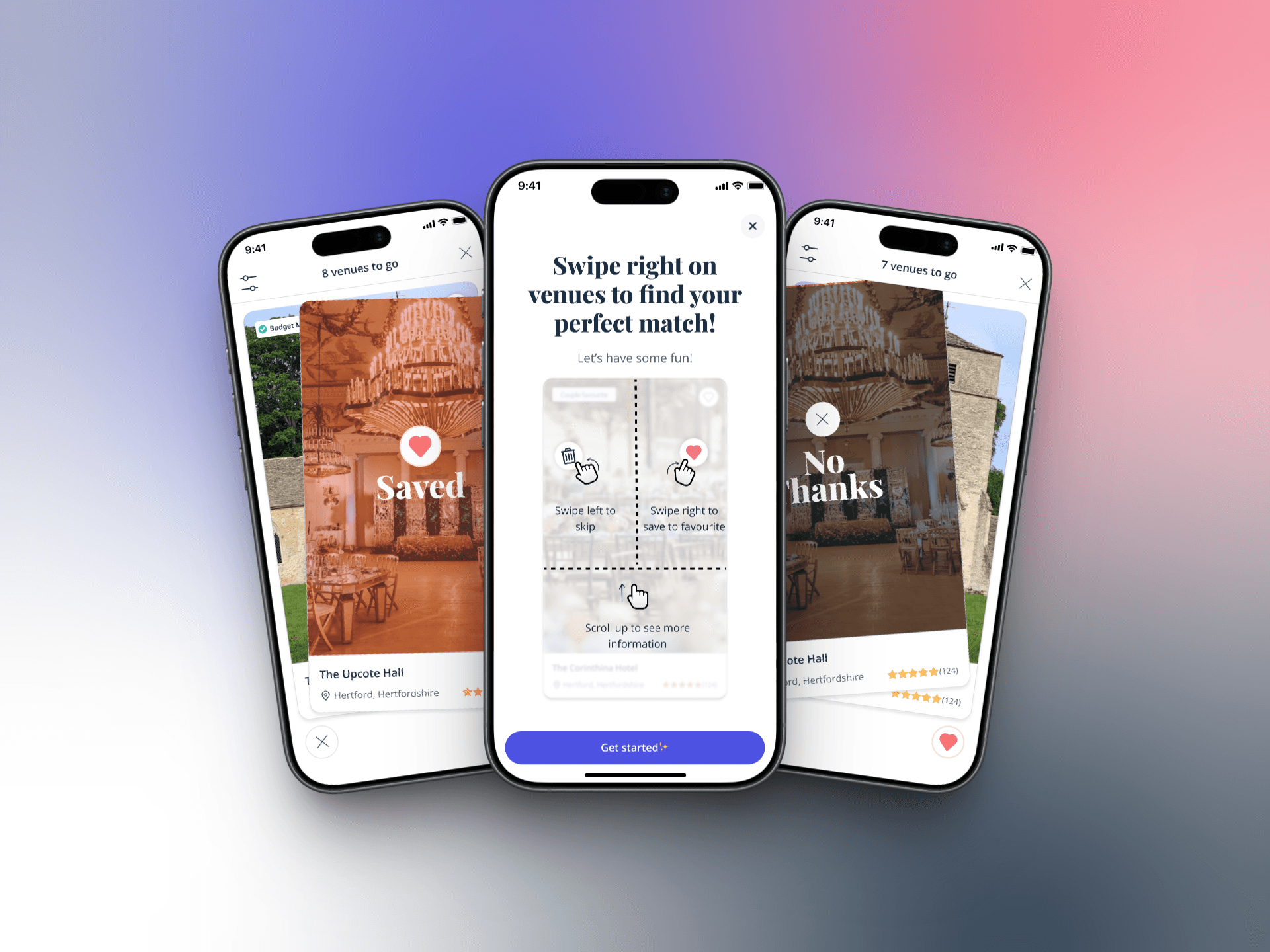
Swipe right to add a venue to favourites, left to discard it
Favourites becomes the shortlist; preferences can be changed at any time
After the 10th venue, couples can keep playing for as long as they like
What we built, and the limits we built within
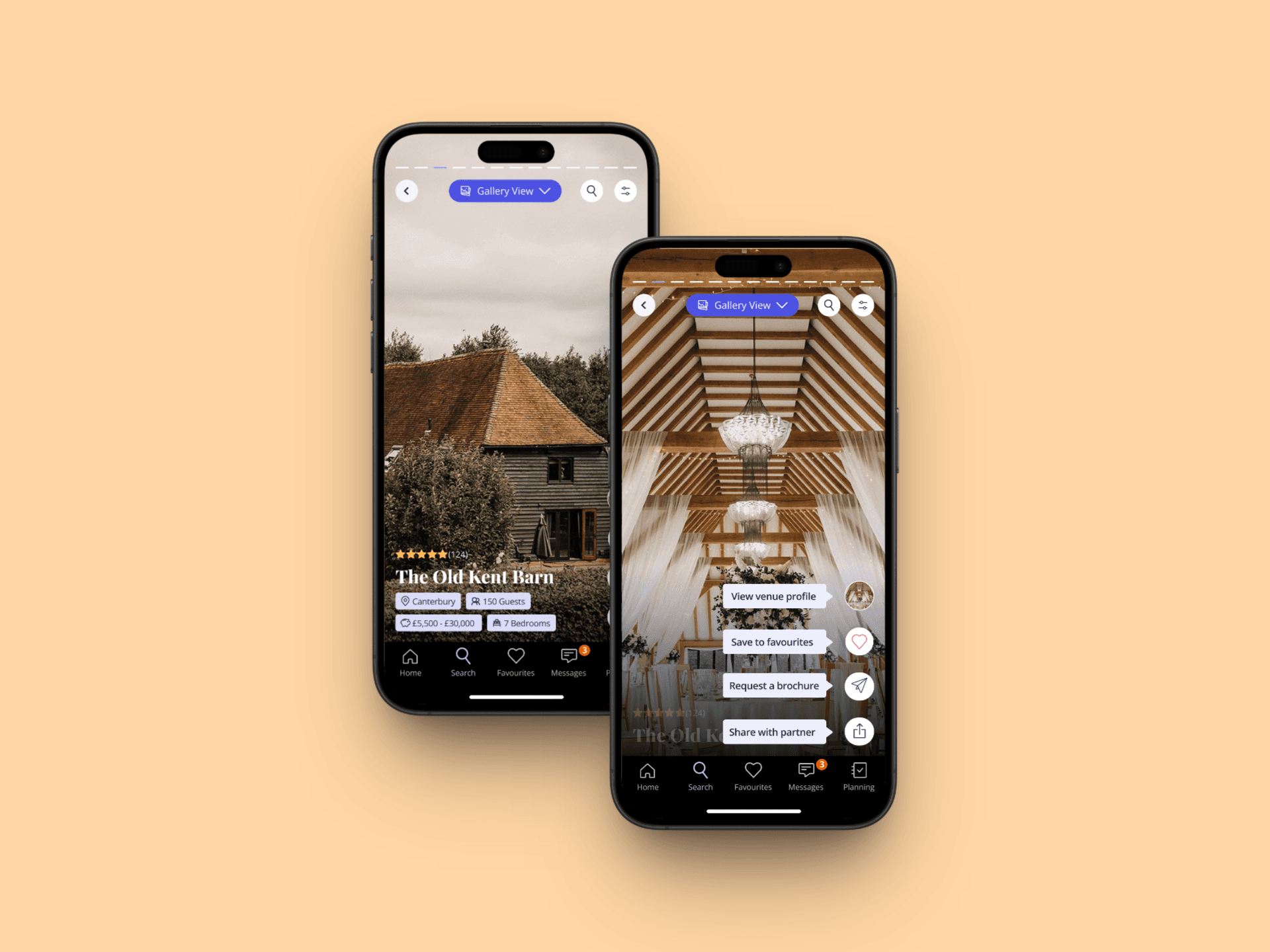
Venue Swiping turns shortlisting into a game. Couples see recommended venues one card at a time, matched to their location, guest count, venue style and deal breakers. They swipe right to add a venue to favourites, left to discard it, or tap for a condensed, image led profile and enquire straight from there. Each play shows 10 venues, and couples can keep going for as long as they like.
Mobile only, in our core markets
Built for low and medium intent couples, not those ready to book
Recommendations ran on an amended concierge engine rather than the normal search
A commercial reality: paying venues buy visibility, and a discarded venue is never shown again
How it works for the people using it
The swiping card
Image led, so a couple’s first reaction is to the space itself
Right to favourite, left to discard: a gesture couples already know
A tap opens a condensed, image led profile, with an enquiry option
The play loop
10 venues per play gives each session a natural finish line
Couples can keep playing after the 10th card, so the game never blocks them
Preferences stay one tap away, so recommendations can be tuned mid play
The list variant
The same recommendations as amended search cards
Shortlist and discard buttons on each card, instead of a swipe
Built to isolate the effect of the gesture from the effect of the recommendations
The calls I made, and why
1. Test the mechanic, not just the idea. Running a list variant with the same recommendations meant we could tell whether swiping itself made the difference, or the recommendations behind it.
2. Recommend, don’t search. Every card was matched to a couple’s location, guest count, style and deal breakers, so each swipe felt relevant rather than random.
3. Ten venues per play. A finish line makes a game feel achievable. Letting couples carry on afterwards meant it never became a wall.
4. Plan for what success would cost. Before launch we mapped the options if Swiping won. Bringing it into Concierge could make couples more intentional and lift FCR, show more venues and capture better shortlisting data for our recommendation engine, though enquiries might dip depending on where the button sat. Replacing search would need the normal search algorithm, full filters, a view switcher and commercial markers like crowns and top spots, and it would cost paying venues exposure, because a discarded venue never comes back.
How we proved it
Experiment design
Control: no exposure to the feature
Variant 1: amended search cards in a list, with shortlist and discard on each card
Variant 2: swiping cards, with shortlist and discard by swiping
Audience: low and medium intent couples, mobile only, core markets
How we’d judge it
Primary: sign up to enquiry conversion
Secondary: sign up to shortlist conversion
Health: Day 1 and Week 1 retention, profile views, FCR
Feature: time on card and condensed profile, discard rate, number of plays
Results
[Add the results of the test]
Looking back
What we learned
[Add what the results showed]
Designing the experiment was as important as designing the interface: a clean comparison is what makes a bet worth placing
Commercial impact has to be designed for up front. A mechanic that delights couples can quietly reduce what paying venues get
What comes next
Combining Swiping with Gallery Browse: tap through content, swipe to decide, and scroll up for the full profile, the complete Tinder model
Handling large numbers of favourites as shortlists grow
Perfect Match was a bet, placed alongside two others with the same audience and the same success metrics, so the answer would be clear.
The design work was as much about the experiment as the interface: separating the swipe from the recommendations behind it, and thinking through what success would cost the venues who pay to be seen.