I led the design of an AI-powered image inspiration feed for couples planning their weddings—a Pinterest-like discovery experience that uses machine learning to surface personalised visual inspiration based on onboarding preferences and natural language search.
I worked as the Senior Product Designer, partnering closely with product and engineering.
I was responsible for:
Defining the interaction model for image discovery
Designing the mobile-only UI and states
Mapping user flows and constraints for the experiment
Aligning the design to retention-focused success metrics
Supporting the A/B test setup through clear UX assumptions
Wedding planning is inherently visual, yet our mobile users lacked an intuitive way to explore and save inspiration during their discovery phase. We hypothesised that creating a frictionless, visually-driven entry point on the homepage could significantly improve early retention by helping couples envision their wedding faster. Without an intuitive way to explore ideas visually, users faced friction when articulating preferences, leading to lower engagement and a higher risk of early drop-off. This limited the product’s ability to emotionally engage users at a critical moment, impacting short-term retention and downstream conversions.
Business Goals
Increase Week 1 retention by 2% (primary success metric)
Improve Day 1 retention as a leading indicator
Maintain or improve Sign-up to Enquiry conversion rates
Preserve First Contact Rate (FCR) quality
User Needs
Through user research, we identified that couples:
Feel overwhelmed during initial wedding planning phases
Struggle to articulate their vision in text-based searches
Need visual references to make decisions confidently
Want to save and organise inspiration without friction
Design Hypothesis
Users who engage with visual inspiration tools within their first session will demonstrate higher retention because they:
Quickly find value in the platform
Build an emotional connection to their wedding vision
Have a concrete reason to return (saved inspiration)
Could we use ML-powered image search to reduce time-to-value and drive meaningful engagement in the critical first week?
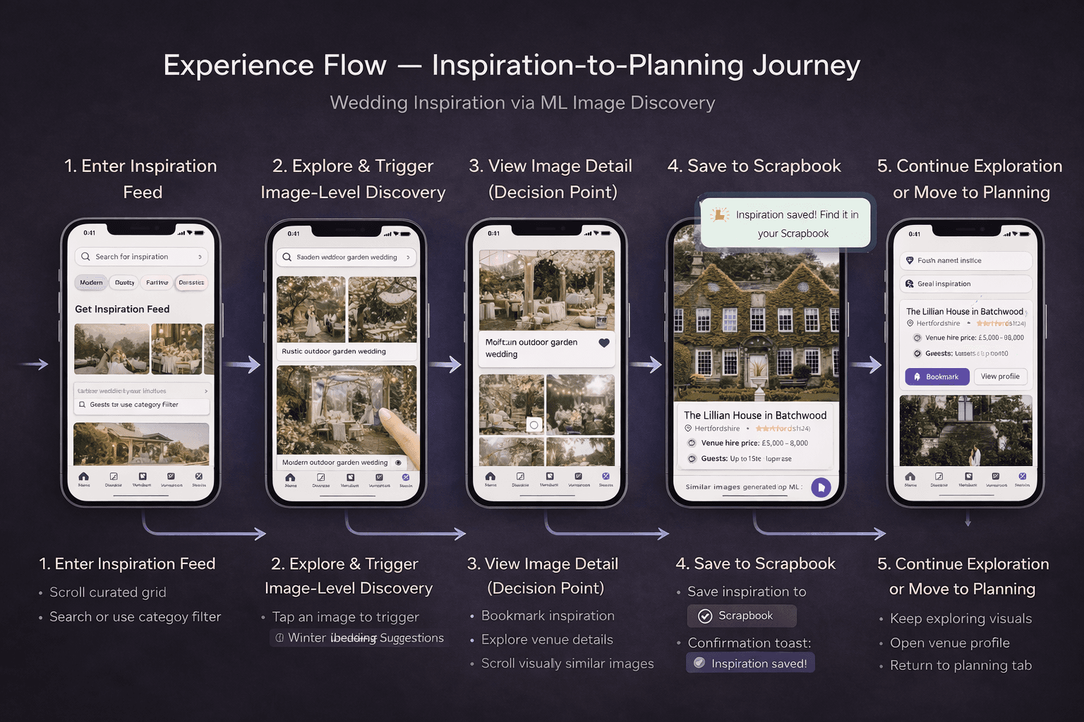
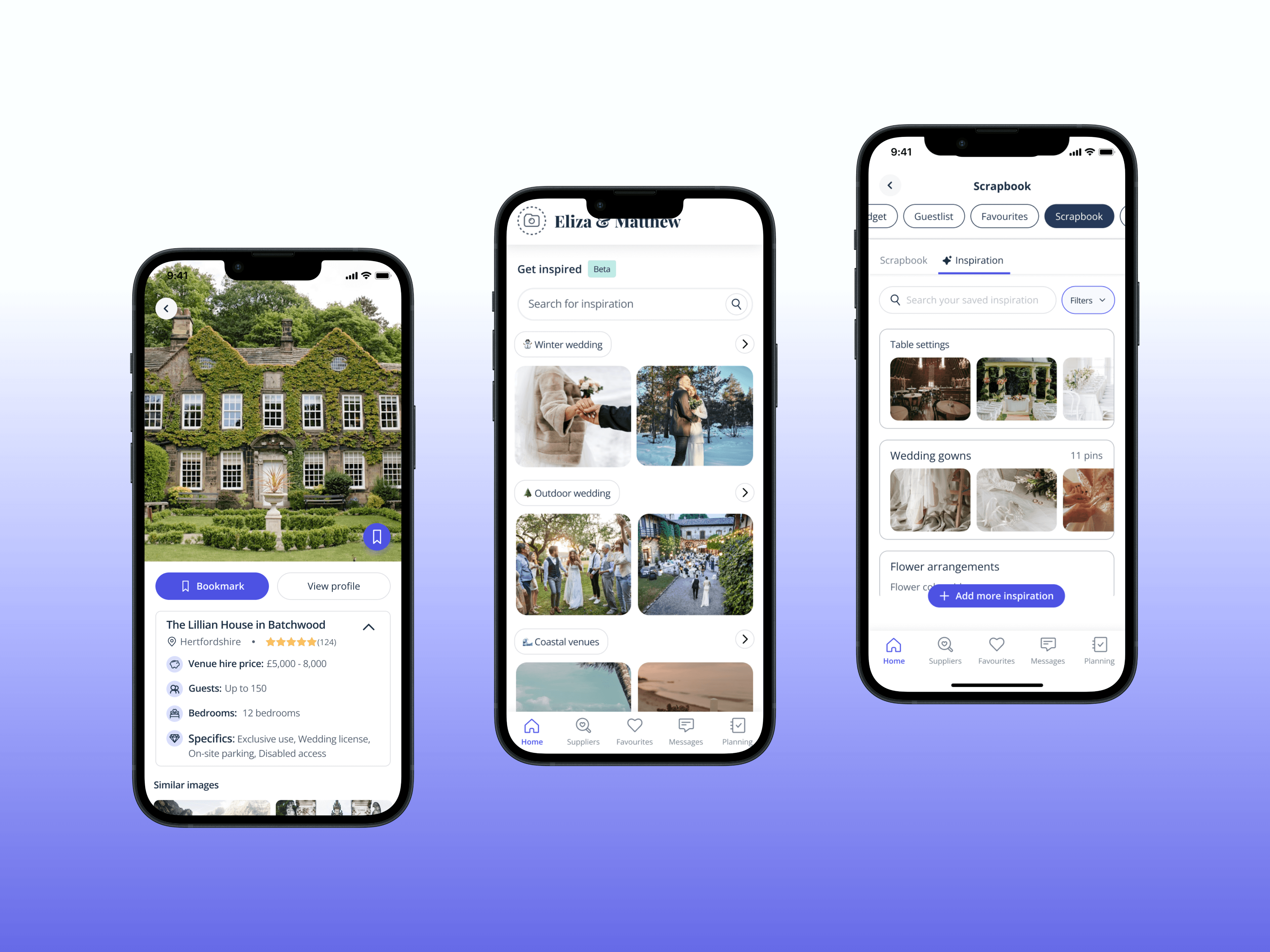
We introduced an ML-powered image inspiration feed, displayed at the bottom of the homepage on mobile. The feed dynamically surfaces images based on: Onboarding keywords User-entered prompts This feature acts as a low-effort entry point into discovery, similar to Pinterest, but contextualised for wedding planning.
Technical Limitations:
Mobile-only implementation (resource constraints)
UK market exclusively (A/B test scope)
Limited vendor profile interaction (MVP approach)
Design Constraints:
No preset category browsing (relied entirely on ML/search)
Vendor cards showed only name + location (reduced commercial friction during discovery)
Had to coexist with existing homepage modules without disrupting core conversion paths
These constraints shaped a laser-focused MVP designed for rapid validation.
1. Research & Insights
I analysed competitor patterns (Pinterest, Instagram Save features, Houzz) and conducted lightweight user testing with couples in the consideration phase. Key insights:
Users trust ML recommendations when initial results feel relevant
The ability to refine searches visually (similar image search) reduces cognitive load
Quick-save functionality is critical—couples won't return to images they can't relocate
2. Information Architecture
I positioned the feed at the bottom of the homepage to:
Avoid disrupting high-intent user flows (top of page)
Capture exploratory behaviour after initial orientation
Create a "Pinterest scroll" moment for engaged users
3. Interaction Design
Natural Language Search Bar
Designed for complex, conversational prompts (e.g., "rustic barn reception with string lights")
Used progressive disclosure: simple input field that expanded on focus
Real-time ML processing with skeleton loaders for perceived performance
Image Cards
Large, tappable surface area optimised for thumb zones
Clear "Save" affordance (heart icon, persistent across states)
Subtle vendor attribution to avoid commercial friction
Similar Image Discovery
Tapping any image opened a detail view with ML-suggested similar images
Horizontal scroll pattern for rapid browsing
Vendor card at bottom (low prominence, opt-in interaction)
4. Visual Design
Clean, content-first layout that let imagery shine
High contrast save buttons for accessibility
Smooth scroll performance (optimised image loading)
• Cohesive with existing brand system while feeling distinctly "inspirational"
A/B Test Structure
Control: Standard homepage without image feed
Variant: Homepage with ML image feed at bottom
Success Criteria:
✅ Test succeeds: +2% Week 1 retention
❌ Test fails: -2% Week 1 retention
Guardrail Metrics:
- Sign-up to Enquiry conversion (cannot decrease)
- First Contact Rate quality (must remain stable)
Decision 1: Bottom-of-Page Placement
Why: Preserved high-intent conversion paths while capturing exploratory behavior. Data showed users scrolling past primary CTAs were in research mode.
Decision 2: ML-First, No Manual Presets
Why: Forced us to nail personalisation from the start. Also differentiated us from competitors relying on generic category browsing.
Decision 3: Minimal Vendor Profile Interaction
Why: Reduced commercial friction during the inspiration phase. We optimised for scrapbook saves (future intent) over immediate vendor engagement.
Decision 4: Similar Image Search
Why: User testing revealed couples often can't describe what they want but recognise it when they see it. Visual refinement created a feedback loop that improved ML accuracy.
Week 1 retention impact: [+2.7%]
Day 1 retention impact: [+1.5%]
Engagement rate with feed: [+67%]
Average images saved per user: [9.2]
What Worked
Natural language search met a real need for complex, nuanced queries
The save-to-scrapbook flow created a clear retention hook
Positioning at bottom of homepage balanced discovery with conversion
What I'd Iterate On
Add light preset categories as entry points (not everyone wants to type)
Test vendor profile expansion for users showing high intent signals
Consider desktop adaptation for users switching devices
This project demonstrated my ability to design data-driven, AI-powered features that balance user delight with business objectives. By focusing on a tightly scoped MVP with clear success metrics, I delivered a testable solution that provided immediate user value while de-risking a larger strategic bet on ML-powered discovery.
The image search feature exemplifies my approach: deeply understand the user problem, design for measurable impact, and ship iteratively.


